The Literary Periodicals For People Who Love Beautifully Presented Fiction And Non-Fiction
During the last century, one of the greatest of the classic pulp periodicals was the magazine Argosy. Writers as diverse as Erle Stanley Gardener, Edgar Rice Burroughs, and Max Brand published stories within its pages, and for almost a hundred years, Argosy weathered changes in the marketplace and in the tastes of its readership to keep publishing entertaining fiction and non-fiction features. The original, which was begun under the direst of circumstances, finally folded in 1978. There was a short-lived attempt to revive it in the 1990′s, but other than an increased focus on genre, little was done to distinguish it from other full-sized fiction mags, and it too was shuttered.
Coppervale International, James A. Owen’s Studio, revived the trademark one more time in 2003 with several goals in mind. First, to produce a quality magazine with a nice mix of fiction and non-fiction from the best writers of the day. Second, to elevate the presentation and production quality to make what was published as desirable as possible, to “give good hand.” The size was carefully chosen, as was the decision to include longer fiction – novellas, which are often considered the poor stepbrother to novels – as a separately bound book, and to put both volumes inside a decorative slipcase.
Presented as “An assortment of literary splendours and marvels, complete in two volumes and housed in a very handsome slip-case” only three editions were published between late 2003 and 2006. The first two, published as Argosy Magazine, were at the heart of the distribution fiasco that also saw the shutdown of the arts magazine International Studio; the third, rebranded as Argosy Quarterly, was presented more as a book package than a periodical, and was published primarily to try to fill the orders and subscriptions, and because the material within had already been assembled and paid for.
It was a grand experiment which was nominated for (and frequently won) many awards, and lost a great deal of money. But what was actually produced within the pages of those three publications was of unquestionable quality.
James A. Owen served as the Designer and Editorial Director, but the content was largely assembled by an editor of impeccable taste (Lou Anders, who declined credit for his work on the third edition, but who went on to a career-making position as editor of a great line of books at Pyr), and as hard as these men worked on them, it was the talent who made Argosy look good.
Argosy One had a cover by the legendary team of Leo and Diane Dillon, and featured fiction by Jeffrey Ford, Caitlin R. Kiernan, Ben Rosenbaum, and other brilliant writers. Adam Roberts interviewed Samuel R. Delany, and the novella, which featured a cover and interior illustrations by Jon Foster, was written by Michael Moorcock. Both books were printed in two colors, black and dark green, and the main magazine was illuminated throughout by monochromatic photographs of still-living blues musicians of the Mississippi Delta, taken by the respected illustrator George Pratt.
Argosy Two raised the stakes in several ways. First, it was printed in full color, to better showcase the art of the main magazine: the secret art of Dr. Seuss. It had a cover by Greg Manchess that was too beautiful to crop, so it was decided to add a gatefold cover. Kevin J. Anderson wrote an excellent non-fiction piece, and Eric Spitznagel conducted an entertaining and regrettably profanity-laced interview with Neal Pollack. And the fiction also raised the bar: stories by Jeff VanderMeer, and Mike Baron, and Carol Emshwiller, and Mike Resnick, and O’Neil De Noux; and perhaps best of all, the novella was a collaboration between Charles Stross and Cory Doctorow, with a cover and illustrations by John Picacio.
That’s a hard act to follow.
(There was also an interesting side effect to the distribution battle that was taking place: some of the wholesalers and chains didn’t like – for various stupid reasons – the two-volume slipcased format. However, having sold subscriptions for that format, as well as placed advertising, it had to be released that way. So the compromise was to split the print run on Argosy Two: half was the two-volume “connoisseur’s” edition, and half the one-volume “proletarian” edition. Didn’t make them happy – the new complaint was that Argosy was cannibalizing the newsstand sales by also offering the nicer – previously unsalable – two-volume edition for the same price. Lesson learned – do what you plan to do, period, and don’t try to change trains while en route.)
Argosy Three was the last edition to be published in that gorgeous format, and it went out with a bang. Printed in Sepia on off-white stock, the main magazine was decorated with pen and ink illustrations by the awesomely talented Bill Sienkiewicz. The cover was by Mark Summers, and the cover to the second book – the first part of the brilliant “Dragons Of Manhattan” by John Grant – was by Joan Hall. The legendary writer William F. Nolan contributed a spectacular non-fiction piece on what really happened to John Dillinger. And the fiction was the cream of the literary crop: Zoran Zivkovic, Steve Rasnic Tem, Charles Coleman Finlay, and James’ own happy discovery, the remarkable Marly Youmans.
As stated before, it was a great experiment. Writers were paid the second-highest rate in genre fiction (behind only SciFiction, the online venue), and Argosy won several design awards. Plans were in the works for a fourth edition, which was intended to conclude John Grant’s story (which has since been published in its complete form), and a story James commissioned Jeff VanderMeer to write called “Errata” (which tor.com published online). Saner thoughts prevailed, and James focused on writing and illustrating novels – which was pretty much how he paid off the printer bills and backers for Argosy. But despite all the grief, and lost money, and whatever else went on at that time to make James want to chop off his own arm before venturing into newsstand magazines ever again – the three editions Coppervale produced were of unquestionable quality.
Mark Watson at bestsf.net wrote, “…presentation-wise, the magazine is top-notch. The two-volume slipcased version is so attractive you’ll find yourself leaving it on the coffee table in the living room in the hope that someone will pop in and notice it. The most handsome magazine of the year so far.”
And Rick Kleffel of The Agony Column wrote: “The one that really wowed me, however, was Argosy. Argosy should go right to the top of your buy list. It is really something quite special… This is the way all paperback books should be printed but aren’t. It’s heavy, beautiful and built-to-last. And getting Dr. Seuss into Argosy is so right that it’s almost beyond words.”
The following can be purchased from the Coppervale International website.
![]()
 Vol. 1, No. 1 –
![]()
 Vol. 1, No. 1 Novella –
![]()
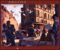 Vol. 1, No. 2 (w/special cover) –
![]()
 Vol. 1, No. 2 Novella –
![]()
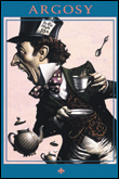 Vol. 1, No. 3 –
![]()
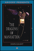 Vol. 1, No. 3 Novella –
![]()
Argosy Presents: The Wonder Book – forthcoming
![]()
